A Project by Michael Romashov
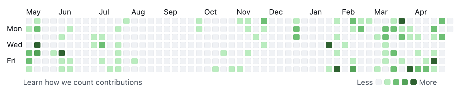
As software engineers, GitHub is one of the most important tools in our arsenal. We use it to host our projects, collaborate with other engineers, and to capitalize on the skills and curiosity of the open source community. When it comes to understanding one's GitHub activity, the user interface provides us with the ubiqutous heatmap that has made its way to other websites such as LeetCode:
But what if we wanted more? What if we wanted to compare our performance year-to-year in a more obviously comparative manner? What if we wanted to know our trends on a day-by-day basis? For that kind of insight, we have to do our own analysis.
Thankfully, the GitHub API makes it ridiculously easy to grab all of your commits through their /search/commits endpoint[1]. By running queries against the endpoint, we can get a paginated response with every single commit made from the dawn of time (well, from the dawn of GitHub at least 😉).
While the API is great, it does have some limitations that we must work around. The biggest being that each response is limited to 100 commits and in total we can only grab the first 1,000 commits with a single query.
Therefore, to obtain the data we must first deal with the pagination by grabbing 100 records at a time, flushing the result to disk each time, and then with the per-query limit by changing our query for subsequent requests.
            /search/commits?q=author:MikeRomaa&sort=author-date&order=asc&per_page=100&page=1


            /search/commits?q=author:MikeRomaa&sort=author-date&order=asc&per_page=100&page=2


            /search/commits?q=author:MikeRomaa&sort=author-date&order=asc&per_page=100&page=3


            ... etc ...
This set of requests got us to around June 22, 2021 but there were four more years of commits to be retrieved! For that I had to add an extra date filter to the query and then manually clean up any overlap between the two ranges later.
            /search/commits?q=author:MikeRomaa author-date:>2021-06-22&sort=author-date&order=asc&per_page=100&page=1


            ... etc ...
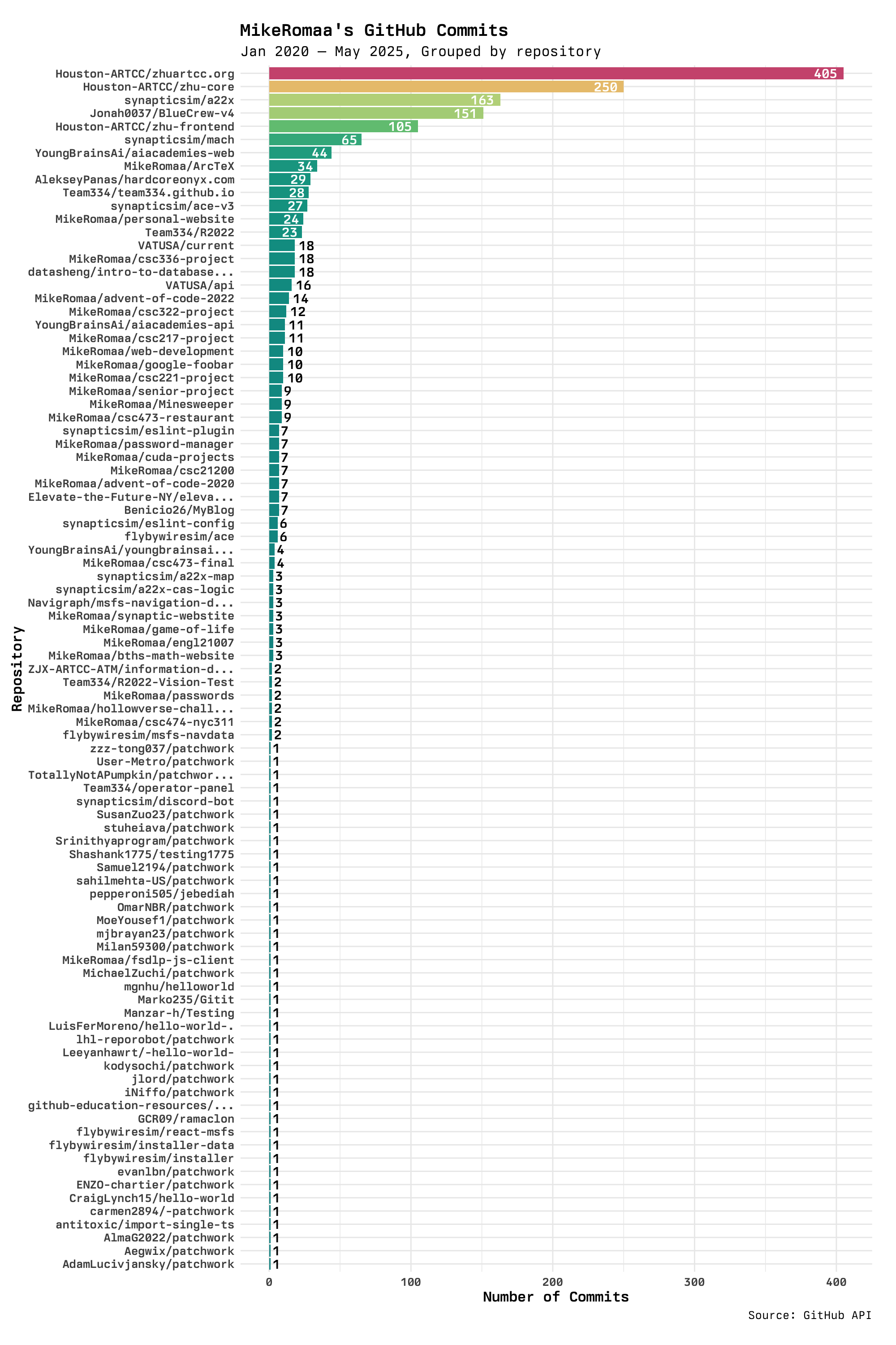
In the end, there were 1,835 commits dating back to early 2020 when I first started to learn web development, through to today where I actively use GitHub on a near-daily basis. For each commit, I wrote the ISO 8601 timestamp of when the commit was authored the and repository name.
The first way I visualized the data was to simply aggregate all repositories by repository and find the total number of commits in each. The distributions follows the typical log-normal curve you'd expect from human behavior.
I was actually pretty surprised to see that a much older project of mine had almost double the number of commits than the next repository. But then I realized that my Git hygiene was much worse back when I was starting out, and I would make tons of really small changes in separate commits.
I was also surprised to see that the list of repositories was quite extensive, but then realized that many of the repositories are actually just forks that include one of my commits (such is the case with all */patchwork and */hello-world repositories). These forks came from a required "intro to Git" activity I had done for a summer course.
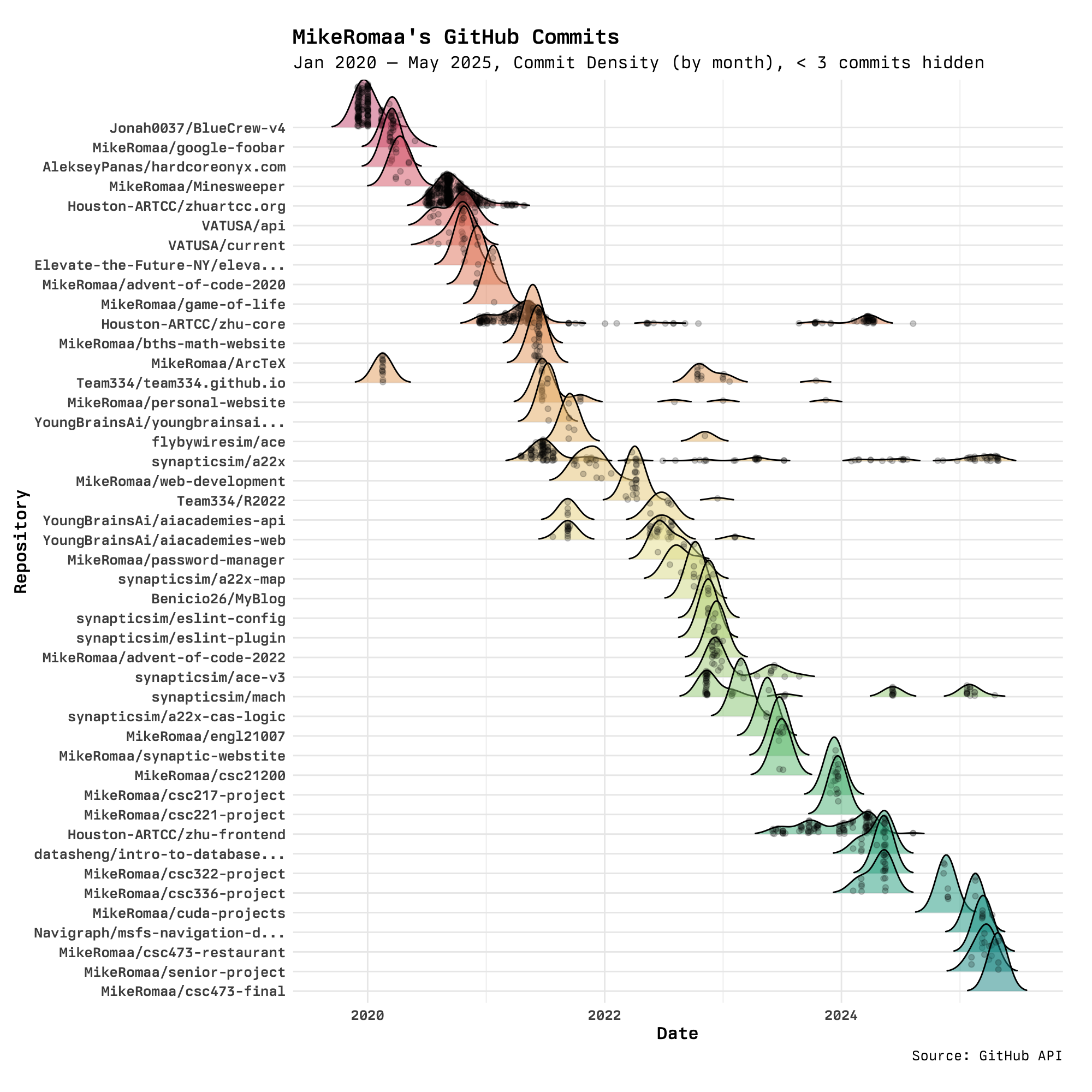
What the previous visualization fails at is showing temporal relationships between the repositories and the number of commits in each. It was hard to tell which repositories were still relevant and not years-old dead projects. To address this, the following visualization plots the density of commits for a month-long period for each repositoriy in a ridgeline plot.
This visualization is much better at showing the aforementioned temporal relationships, and brings along some new realizations. The first standout feature is that there are only three, maybe four projects that can be considered "long-term", i.e. spanning over a year or more. These projects are, in order of oldest to newest, Houston-ARTCC/zhu-core, synapticsim/a22x, synapticsim/mach, Houston-ARTCC/zhu-frontend, and I know myself that only the two synapticsim/* projects are actually active to this day.
Another interesting realization is that my contributions to repositories seem to be often batched together, where there are periods where I will be modifying four to five repositories at once and then those same repositories are never touched again. This is best explained by finals seasons bringing about new projects for courses, but also includes supporting other projects when developing one of my own.
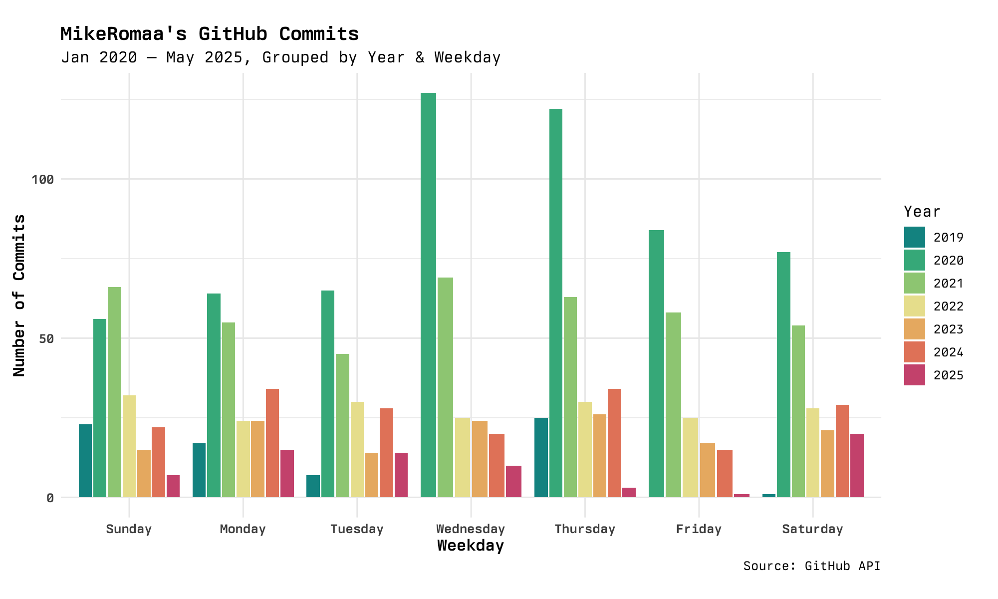
The final visualization attempts to provide an alternative take on GitHub's heatmap. The heatmap is fairly good at showing trends for specific weekdays, and on my work's GitHub Enterprise instance there is a clear strip across all weekdays and none of the weekends. I am, however, curious to see what days I am most active on and compare that across the different years.
A simple side-by-side bar chart does the trick! In addition to seeing trends across the weekdays, we also get a sense for how many contributions are made in each year, with 2020 and 2021 being clear winners. We see that in 2020, there was a strong preference for working on Wednesdays and Thursdays. This preference gradually died down, however, and by 2022 most days were pretty even in terms of contributions. Fast forwarding to 2025, Fridays seem to be very unpopular for me—strange, I don't even take the day off!
While these visualizations are very both visually interesting and insightful, how can I use this insight moving forward with my career?
For one, it is nice to see that my Git hygiene has improved in favor of fewer, more concise commits rather than making tons of small changes. This is something that should be kept up going forward! It would be interesting to see how my peers' Git histories compare, maybe there is a need to teach Git best practices!
For two, I think the number of "long-term" projects I have is healthy. Having too many would quickly run me dry for free time and having too few would not provide a lot of room for learning and growth. The cascading ridgeline plot is very handy for identifying which projects are currently active, and can be used to track how many ongoing projects there are at any given time. This is a plot that would benefit from live updates and interactivity.